
One of the long awaited enhancements coming with Salesforce Spring ’26 release for Flow Builders is Custom Styling for Screen Flows.
Screen Flows have always looked nice, but their designs were constrained until now. If you needed advanced styling, you would either need to use custom Lightning components or CSS hacks. However, with Spring ’26, Salesforce integrated a Style tab right into the Screen element.
That means admins can now create styles for screens without writing code.
What’s New for Screen Flows Styling – Spring ’26
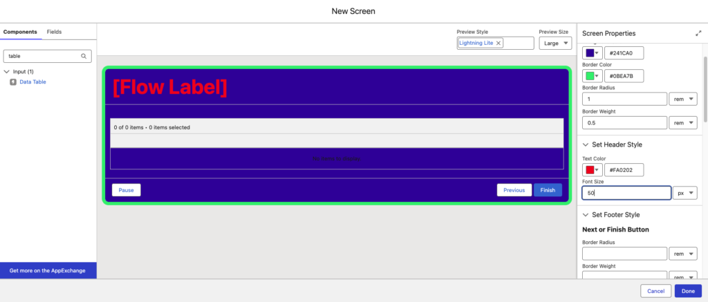
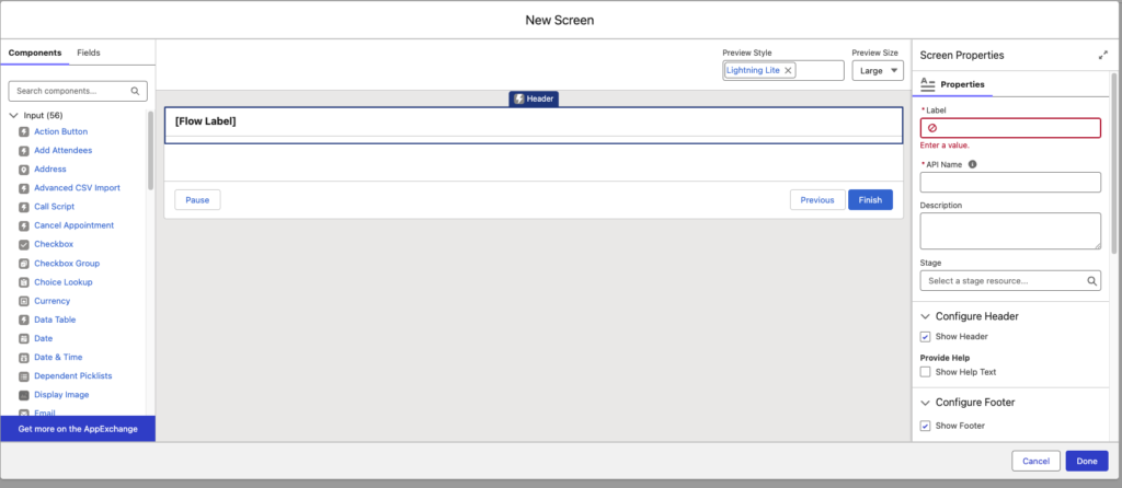
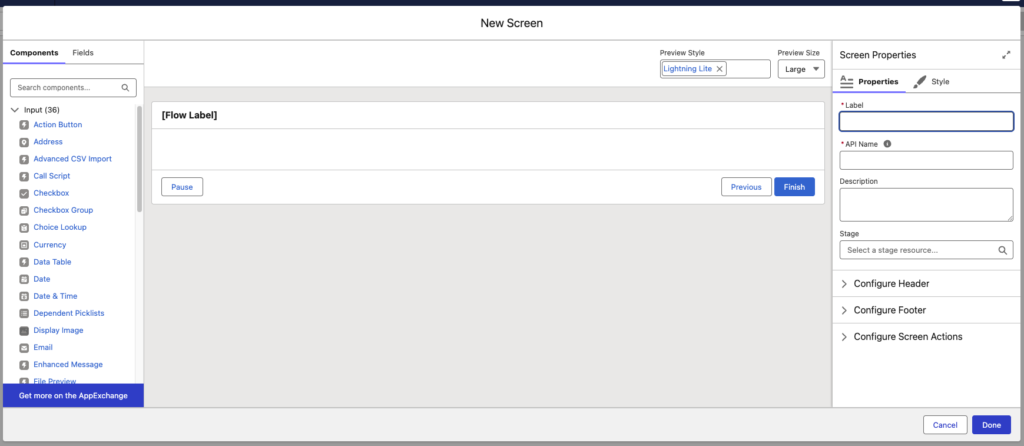
Flow Builder: Style tab in Screen Properties When you open a Screen element in Flow Builder, now you’ll see a Style tab inside Screen Properties.
Styling Capabilities Include:
- Container background color
- Border color, radius, and weight
- Header text color and font size
- Footer styling configuration
- Next / Finish button customization
- Previous button customization
- Pause button customization
- Default, Hover, and Active button states
These enhancements provide greater flexibility in designing user-facing screen flows
Old Screen flow without Styling Capabilities
New Screen flow with Styling Capabilities
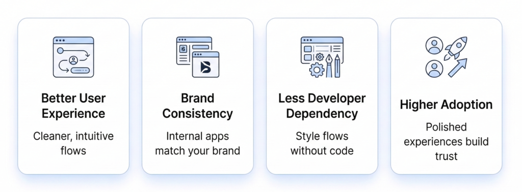
Why This Update Matters
Conclusion
Salesforce Spring ’26 strengthens Flow Builder by introducing native screen styling controls. This enhancement eliminates common UI limitations and reduces the need for custom development in many scenarios.
Organizations using Screen Flows should review existing user-facing flows and consider applying updated styling to enhance clarity, branding, and usability.
As Flow continues to evolve, it becomes increasingly central to Salesforce platform strategy.